
Abel's On Queen
I work with a lot of brands in designing their visual identity, but once in a while I’m fortunate enough to come in at the ground floor and lend a hand in developing the narrative behind the brand itself. Abel’s On Queen was one of these projects; a new barbershop with a backstory steeped in local lore, the Abel’s brand was deeply inspired by the history of the property it rests on.
Visit the Abel’s On Queen website here, and keep scrolling for an in-depth look into the brand development process for a new Downtown Kitchener staple.
Agency: Rest Less Media House
Signage production by Adam Straus
Website design by Chase Denomme
Photography by Teagan Walker


Abel’s On Queen
Reimagining a Landmark
In the spring of 2019, my good pal Mitch Bright came to me with the news that he was going to be opening a new barbershop in Downtown Kitchener. Located at the intersection of Queen and King Streets in the ground floor of the historic Walper Hotel, the new shop brought with it the opportunity to bring the history one of DTK’s most legendary landmarks to the forefront of the brand.
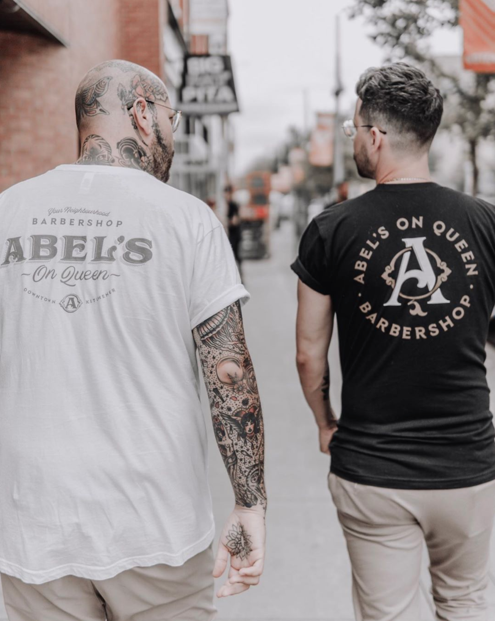
Mitch has been cutting my hair since his early barbering days when he worked out of the upstairs of his mom’s hair salon, and I’ve had the pleasure of being around for the ride as he grew his solo practice into a multi-chair barbershop. From logos and product packaging to merch and event posters, we’ve done it all for the better part of a decade now.
Following the branding work we did for his original Uptown Waterloo shop, Spearhead Barber & Supply, we hungrily jumped into the new Abel’s project head first.
Phase 1: Research
Every project starts with a hefty dose of research to get the creative gears moving, and Mitch’s new endeavour had some serious background to comb through. I had three pillars I wanted to address with my research: Mitch’s prowess as a barber (specifically through the lens of his current shop), the history of the Walper Hotel, and the backstory of its founder Abel Walper.

The Spearhead backstory: Spearhead Barber & Supply specializes in traditional mens’ haircuts, beard trims and hot towel shaves. Aligning with its services, the shop environment portrays an aesthetic that encompasses traditional barbering ephemera and décor. Spearhead’s brand persona is centred in an unapologetic tone of confidence and passion, and its barbers share a rebellious spirit that infuses the shop with a sense of community and mutual motivation.
The Spearhead Barber & Supply brand had garnered a strong sense of loyalty and trust from local customers, and we didn’t want to stray too far from its already established persona. While Mitch’s new Downtown Kitchener shop would introduce a separate personality from the Spearhead flagship, the new brand would need to coexist with the original. The goal was to form a symbiotic relationship that would organically bridge the gap of the transition for customers, while also introducing something fresh and exciting for DTK regulars.
The Walper Hotel backstory: Following an 1892 fire which levelled the old Commercial Hotel on the corner of King and Queen Streets, a German-born entrepreneur named Abel Walper erected a new hotel in 1893 that he called The Walper House—a four-storey deluxe hotel which he marketed as “the finest west of Toronto.” The Walper House immediately became Berlin’s (Kitchener’s name at that time) landmark hotel, welcoming star entertainers, prime ministers, sports figures and other notables. Famed for its excellent food, service and surroundings, The Walper became the destination for national and international travellers visiting the city.
A large scale renovation in 1925 brought a formal dining room and a men’s beverage room into the property. It was these lavish additions that would lead to the proclamation by MacLean’s and Readers Digest in the 1960s that The Walper was one of the finest hotels and dining rooms in the nation and the entirety of North America. Following a multimillion dollar renovation in 2016, The Walper Hotel is now home to over 50 weddings a year, and celebrities continue to grace the hallways of the hotel. Famous guests over the Walper’s 125 years of operation include Eleanor Roosevelt, Bob Hope, Duke Ellington, Louis Armstrong, Madonna, and many more.

The Walper’s Dark Side: In spite of its illustrious reputation of lavish accommodations and famous clientele, the Walper Hotel also has a dark side to its 125-year history. The 1892 fire that levelled the original property on which the hotel was built is considered the most catastrophic event to have ever occurred in Kitchener; four hundred and seventeen people died in that fire.
In prohibition-era 1920s, notorious gangster Al Capone ran points of his alcohol smuggling operation through Kitchener-Waterloo, and is said to have done business in the Walper’s basement bar. As a result, the Walper has been known to be the site of gang-related violence and murders. Guests and staff alike have reported many ghost sightings within the Walper’s walls; countless paranormal occurrences have led to belief that the property is haunted by the presence of various former hotel occupants and employees.
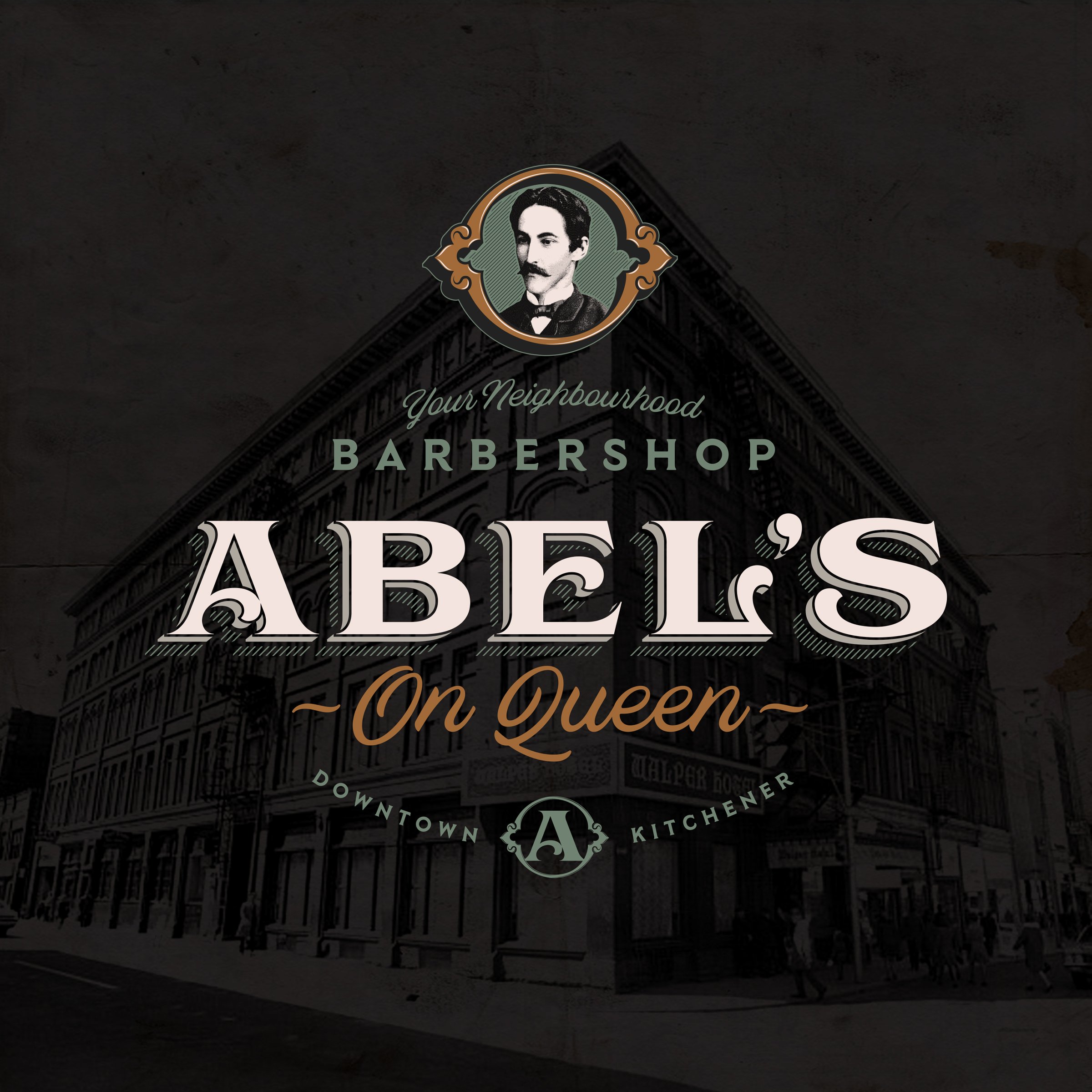
Sightings of a shadowy figure entering and exiting the main elevator and sitting at the grand piano in the ballroom have been reported on many occasions. The figure matches the description of Abel Walper (above left) — a tall, skinny man with long fingers and a trim moustache. Other ghost sightings at the Walper include the likenesses of Reginald Bleeker (above right), a bellboy who was suspiciously tied to the murder of a guest in 1907; Prudence Thackary, a maid who in 1898 died tragically in a mysterious explosion in room 417; and Frederick Gaukel, the original owner of the property on which the Walper was built.
Phase 2: Name & Narrative
Following the research phase, we had our pockets stuffed with inspiration to drive the project forward. The next step was to develop a strong name and narrative to anchor the new shop in a captivating backstory, from which I would build out the creative direction and a unified vision for marketing communications, interior design, and the overall brand experience.
As I generally love to do, I used my research to shape a story. By weaving elements of the Walper’s history together with fictional embellishments to create the new barbershop’s narrative, the brand started to come alive with a personality of its own. A compelling name, story and persona that married the backgrounds of the Walper Hotel and Spearhead Barbershop would ideally connect customers directly to the unique traits that set this barbershop apart from its competitors. With that said, I introduce you to Abel’s On Queen.

Primarily referred to simply as Abel’s, the name is first and foremost a tribute to the man to whom it belongs; Abel Walper was the driving force and vision behind the hotel itself, and his family name has been etched deeply into the history of Kitchener-Waterloo. Rather than focusing on his surname as other Walper establishments have, the new barbershop would instead adopt the founder’s first name as a more subtle, yet equally meaningful homage.
The official longform name Abel’s On Queen is a geographic reference to the shop’s streetfront location on Queen Street in Downtown Kitchener. The addition of this verbiage following the name Abel’s gives the shop distinction and ownability when considering factors such as online SEO and overall brand equity. Additionally, the tonality of the phrase “Abel’s On Queen” also helps to establish an air of personality and approachability, suggesting a friendly neighbourhood establishment endorsed by Abel Walper himself. Conversely, the name Abel’s also suggests that, despite his passing in 1904, the property still belongs to Walper (a subliminal clue that references Walper’s ghost being seen throughout the hotel).
Outside of its contextual meaning and subtle nods to the Walper Hotel’s roots, the name Abel’s also brings simplicity and memorability with it. Short and easily pronounced, Abel’s is instantly recognizable for its brevity, yet the name is uncommon enough to strike a chord in the minds of customers. Many other barbershops establish themselves under lengthy names and imagery that overtly reference traditional barbering and counter-culture (ie. sailors, anchors, tattoos, etc.); the goal with this shop is to stand out from the pack with a name and brand image that is entirely unique and cleverly driven by its surroundings.
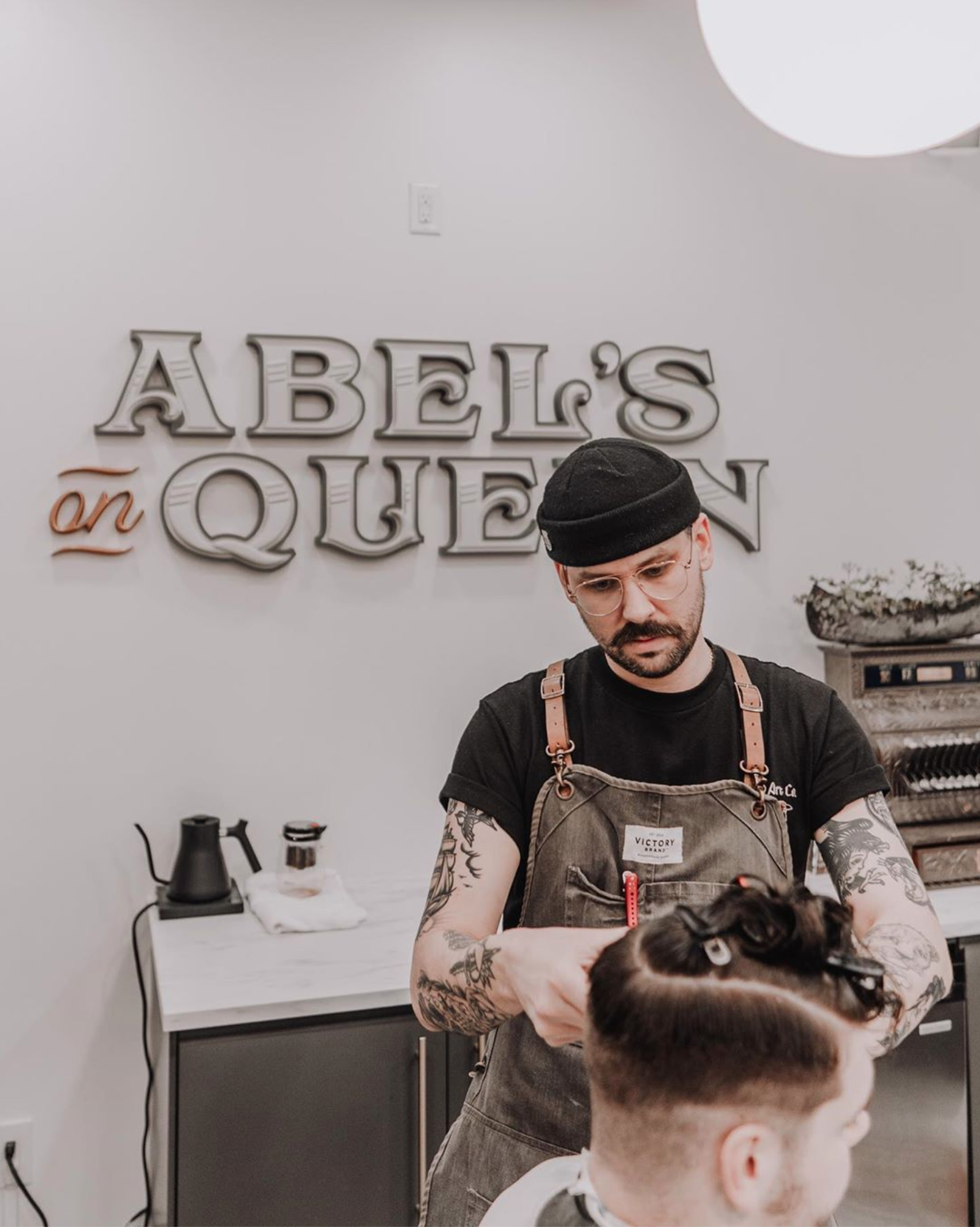
Phase 3: Brand Identity Design
Once we had crafted the brand name and story behind Abel’s, it was time to give the new shop a face. I had a ton of visual reference and inspiration to draw from as I approached the identity design process, everything from the existing fixtures and architecture of the building to the founder himself. My plan was to bridge the old with the new; using the hotel’s historic roots as inspiration, the identity design’s execution would be clean, precise and versatile in order to bring the shop’s brand into a contemporary setting.
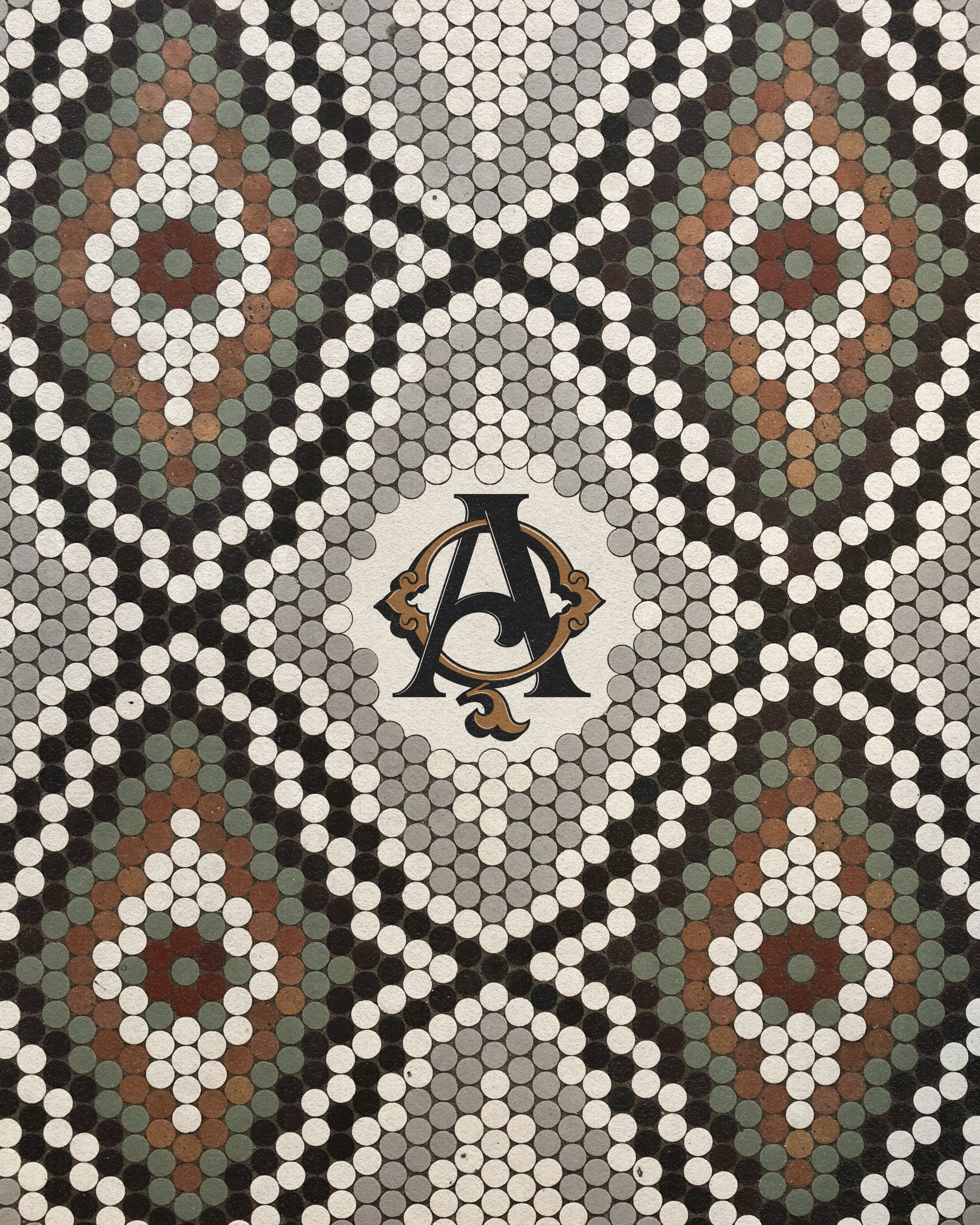

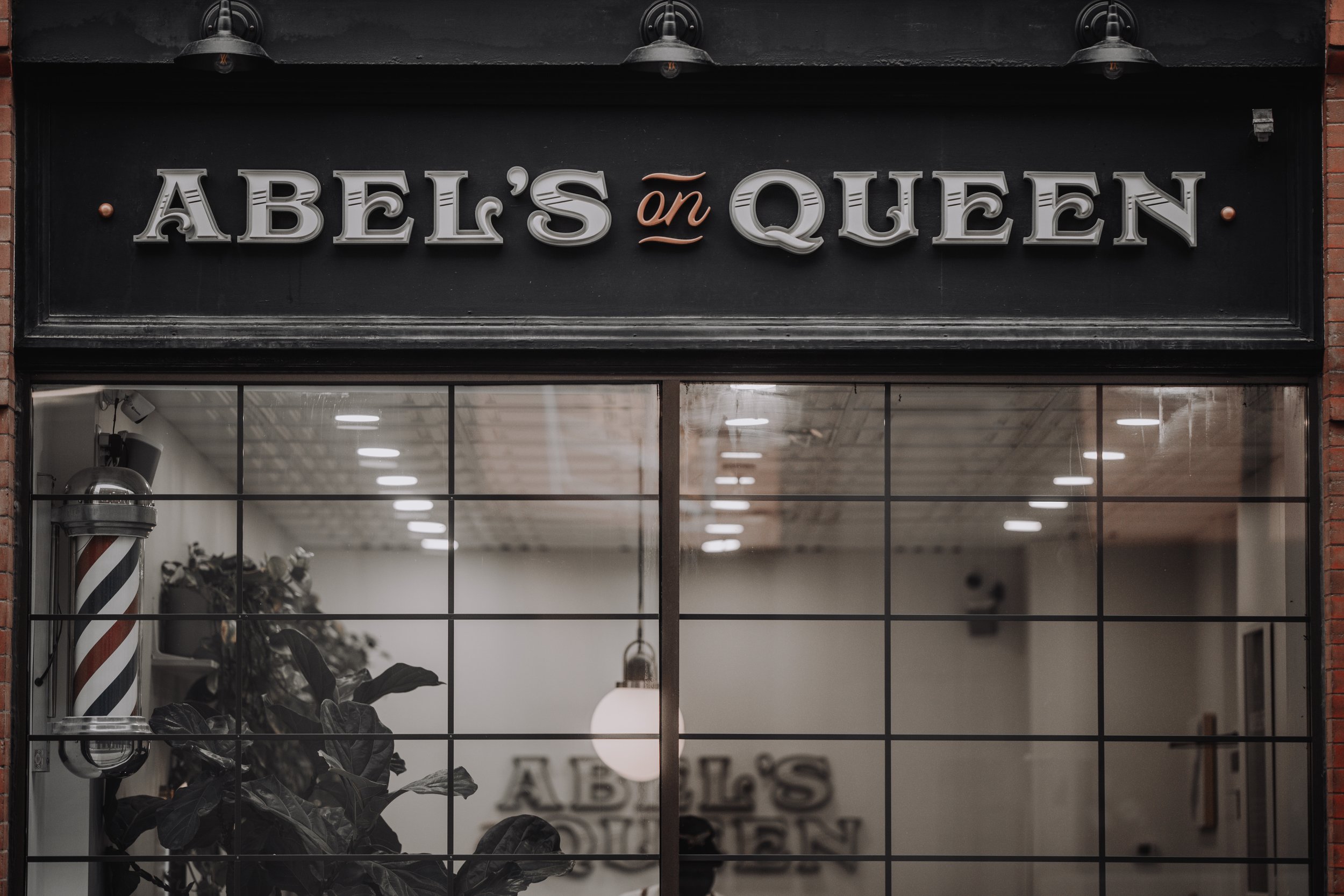
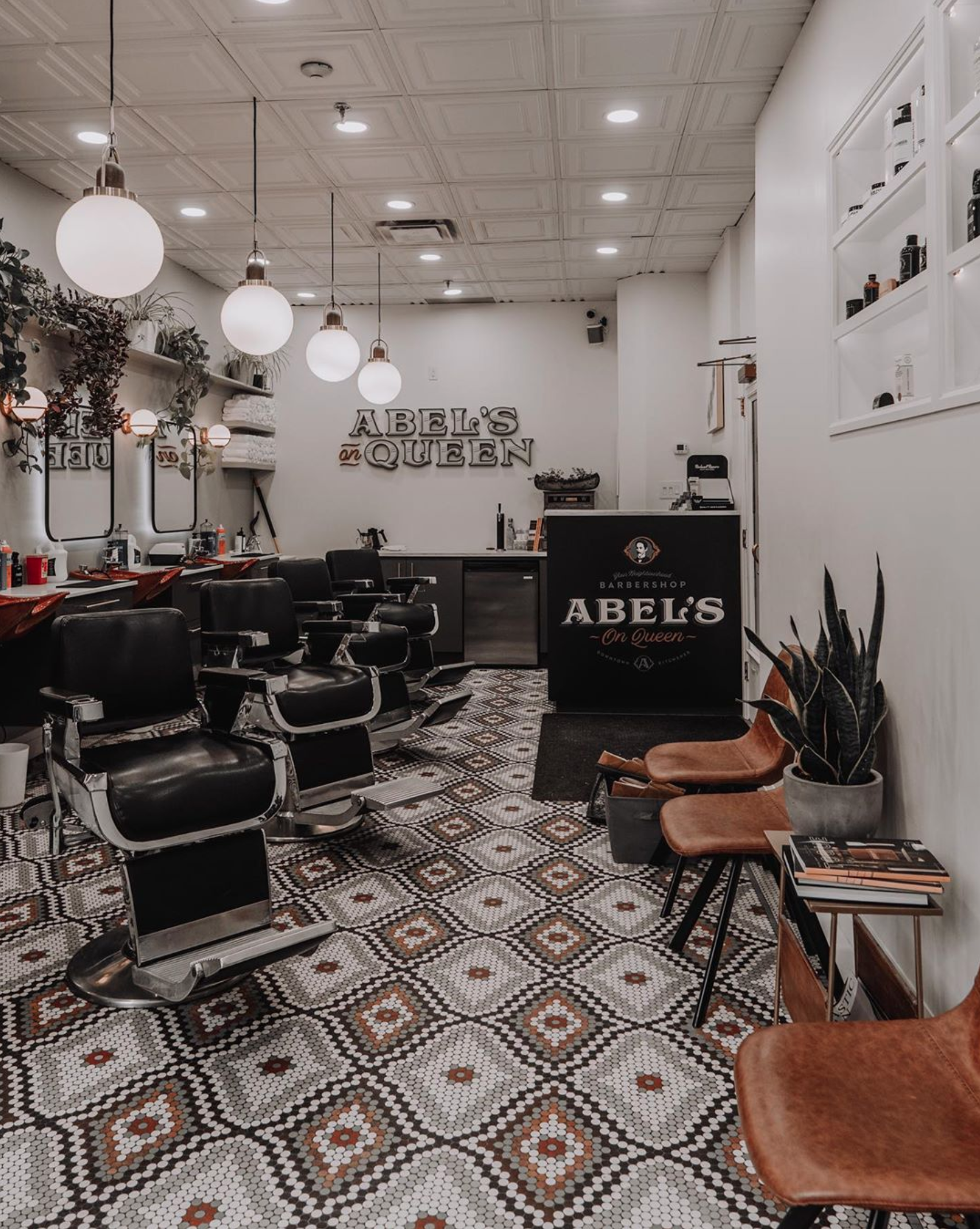
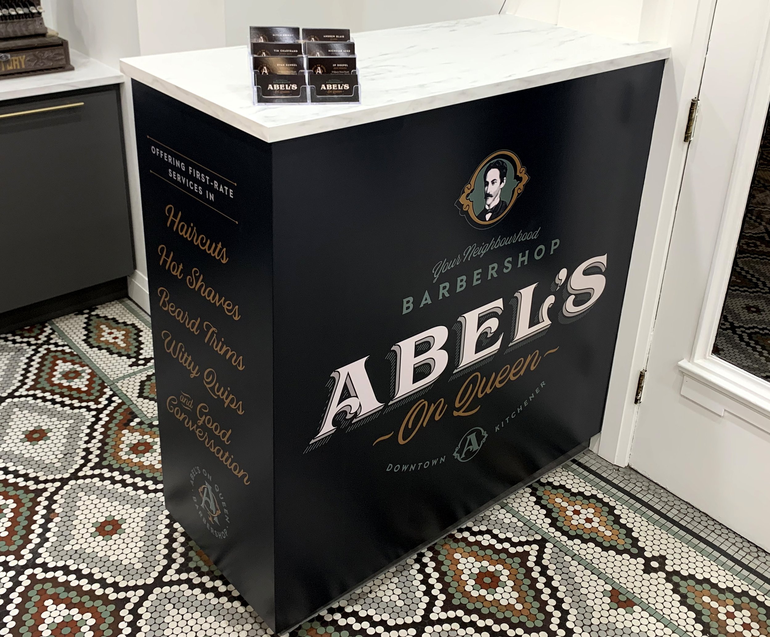
As I dove in, the most prominent reference for me was the floor in the shop and hallway entrance. There was something beautiful about the circular mosaic tiles that came together to create geometric patterns stretched across the entire floor surface area, and the colours were just too good not to carry forward into the shop’s visual identity. Mitch was on the same page; while he planned on gutting the space and fully renovating it for the new shop, the one thing that would stay would be that amazing floor.
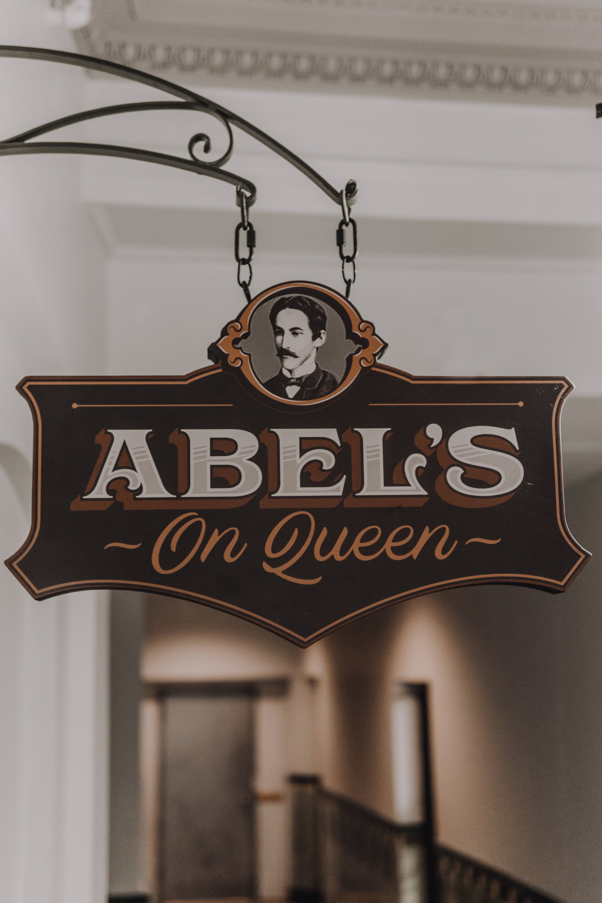
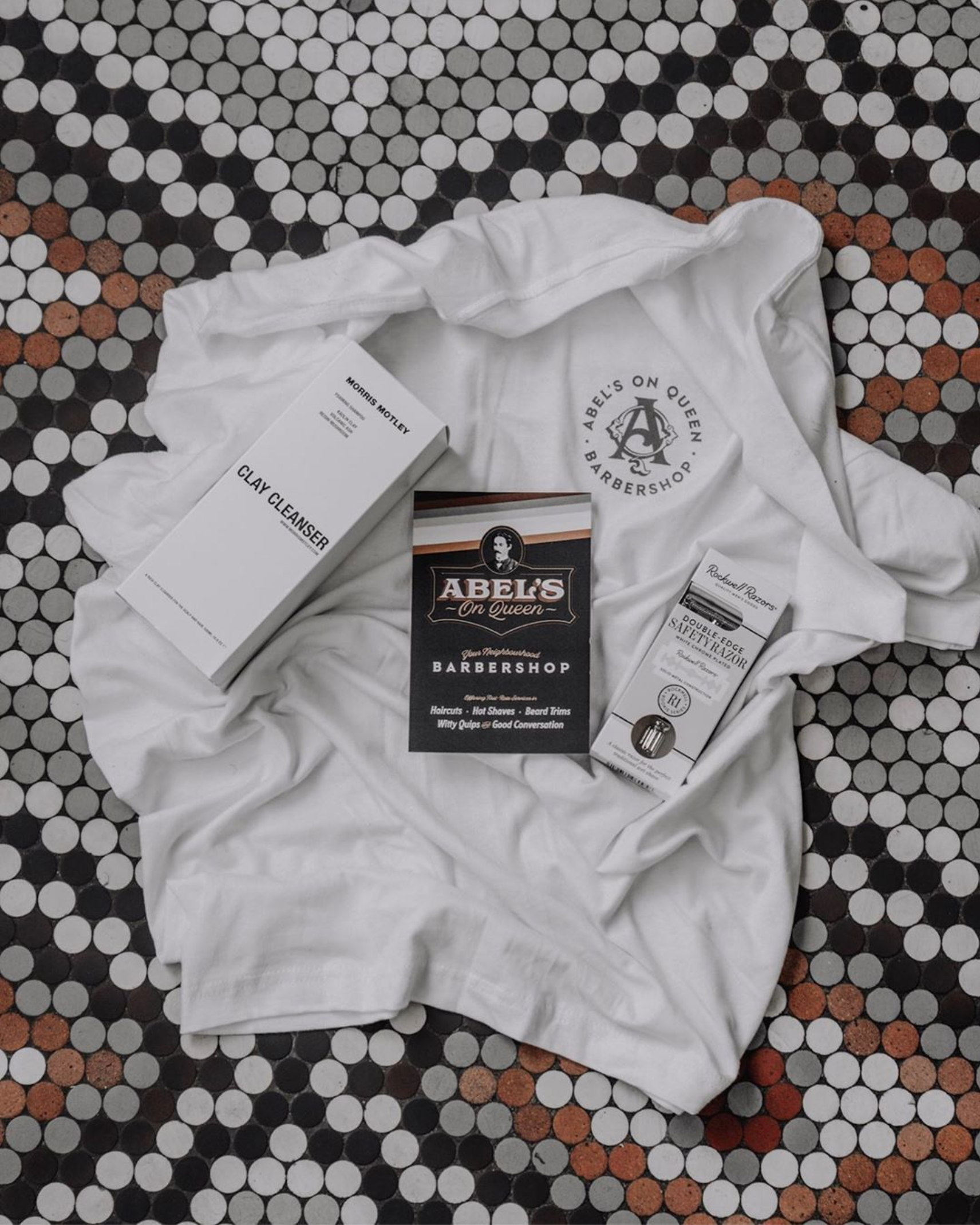
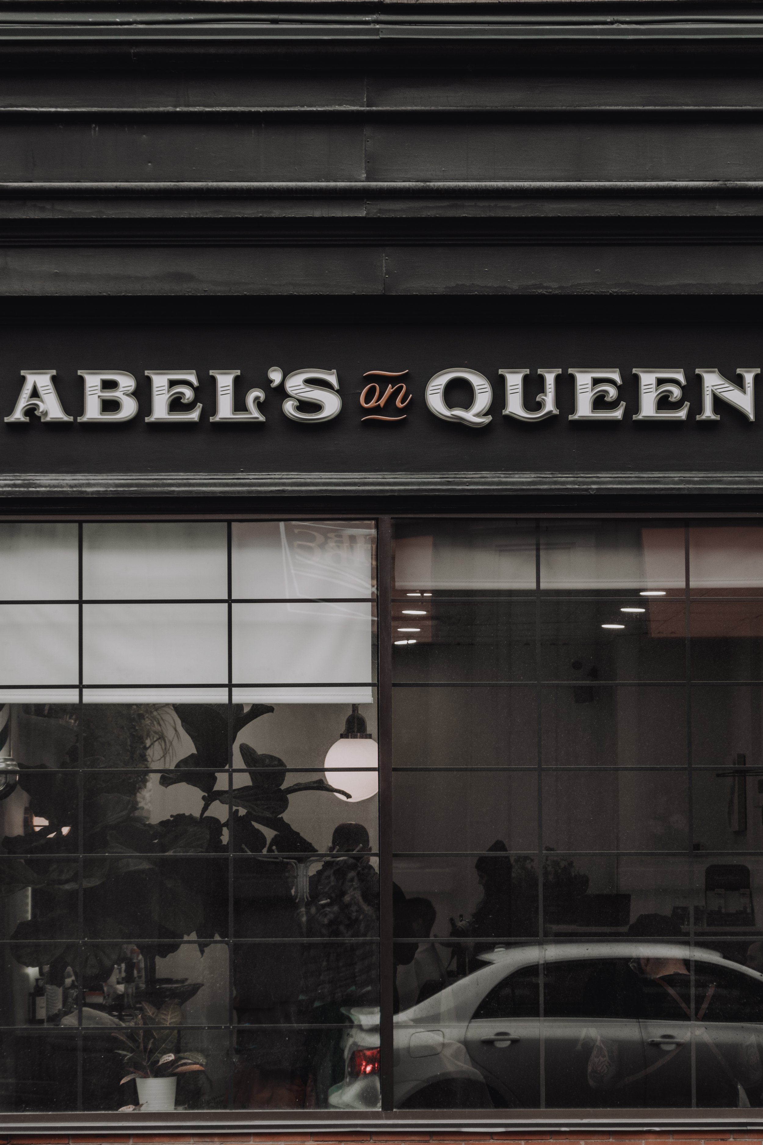
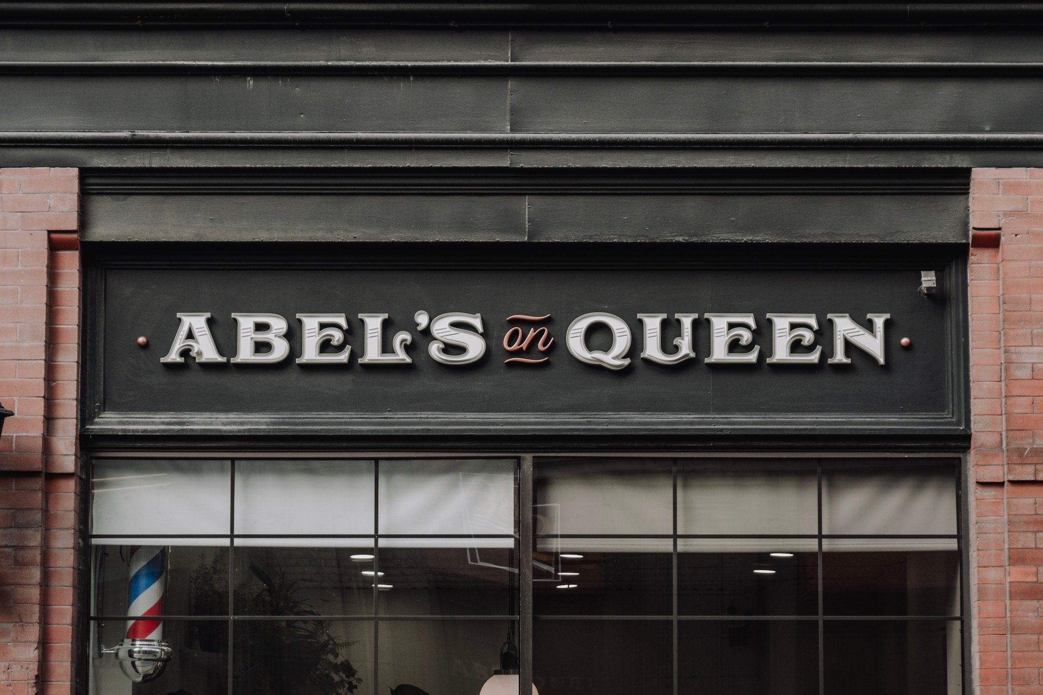
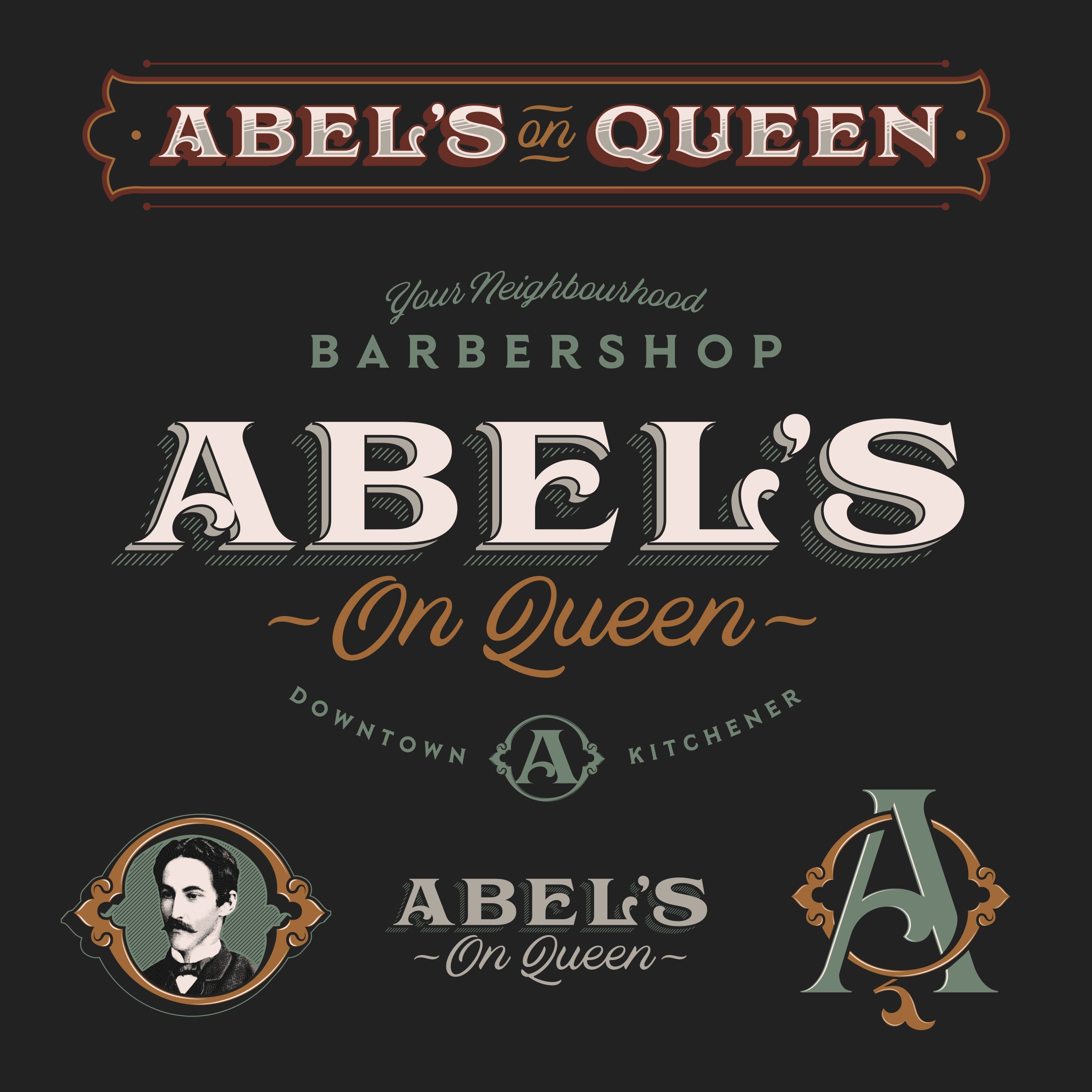
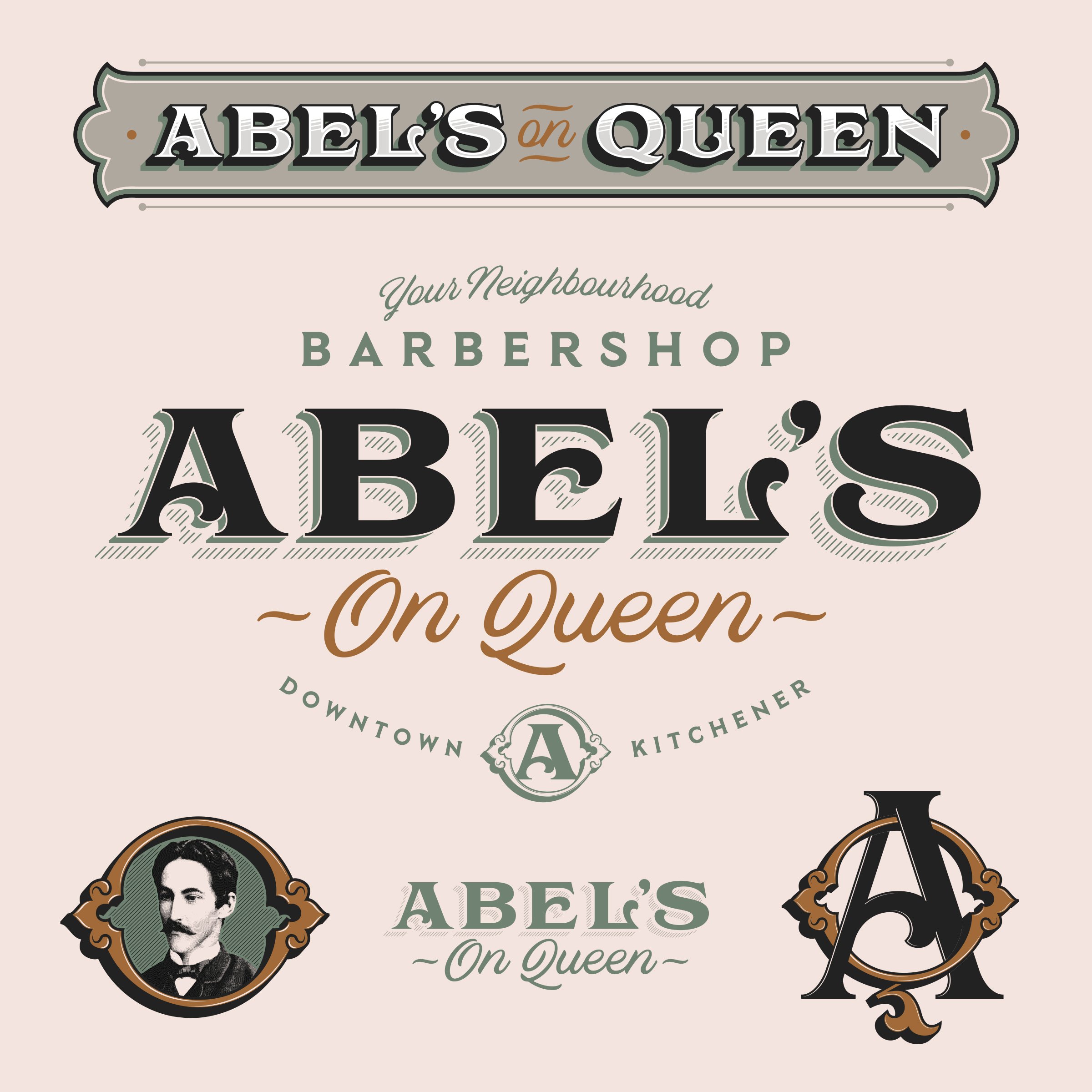
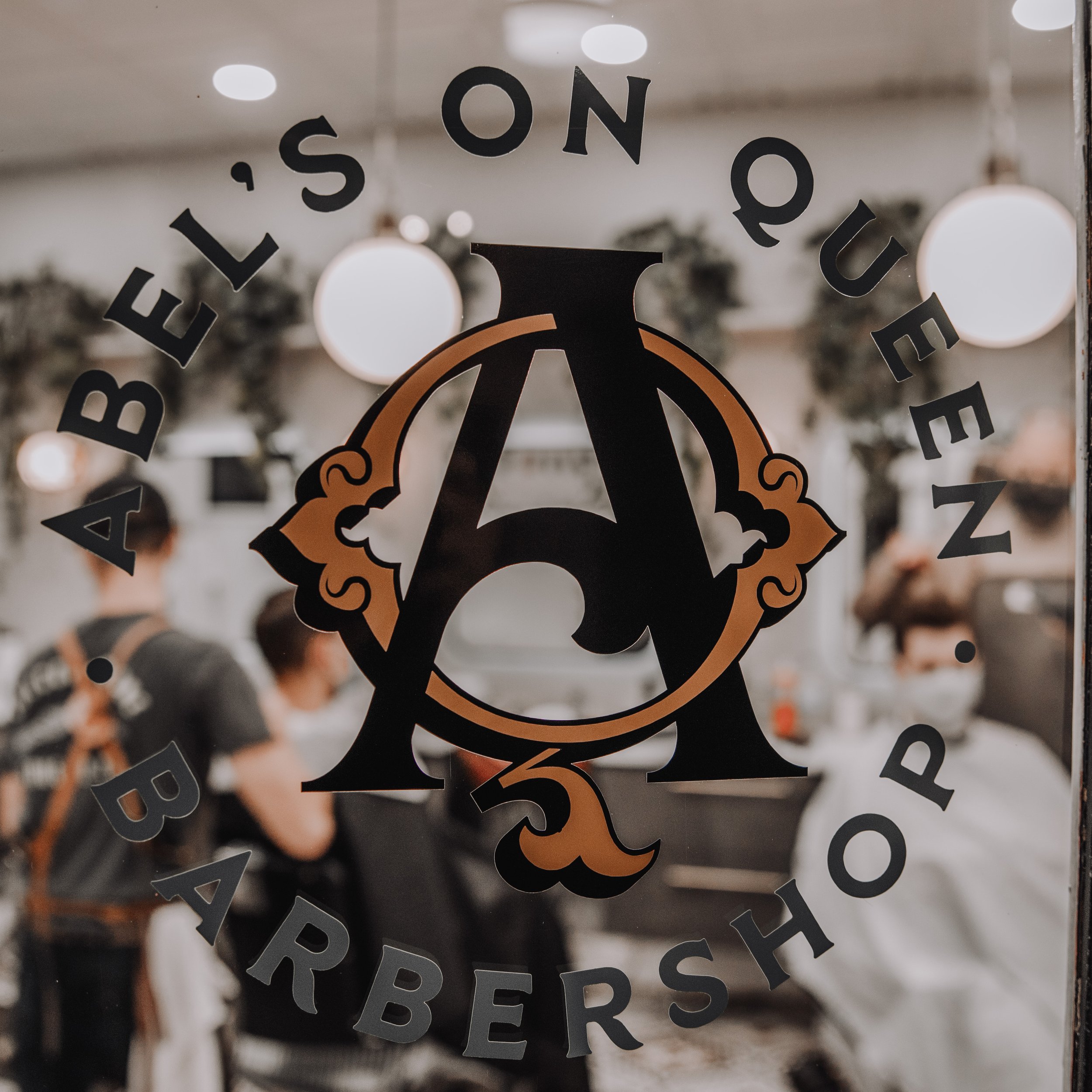
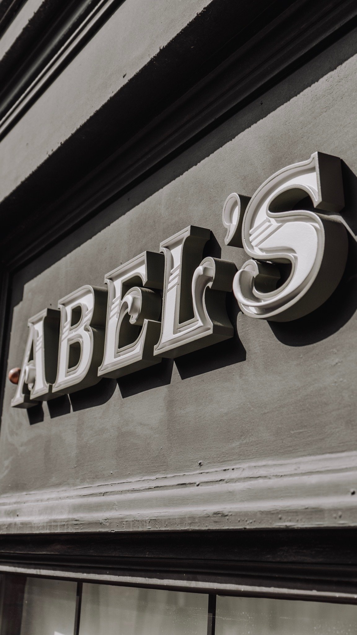
I also wanted to reference the family-run business storefronts typical of early 1900s Kitchener as a nod to the personal touch of a local barbershop as it would have had in Abel Walper’s day. Hand painted shop signage has always struck a chord with me, and I pulled additional inspiration from turn of the century product labels, alcohol, and ephemera to create the Abel’s wordmarks and typography system. Combined with a corresponding monogram and stylized portrait of Mr. Walper himself, we now had the tools to start bringing the new shop to life.
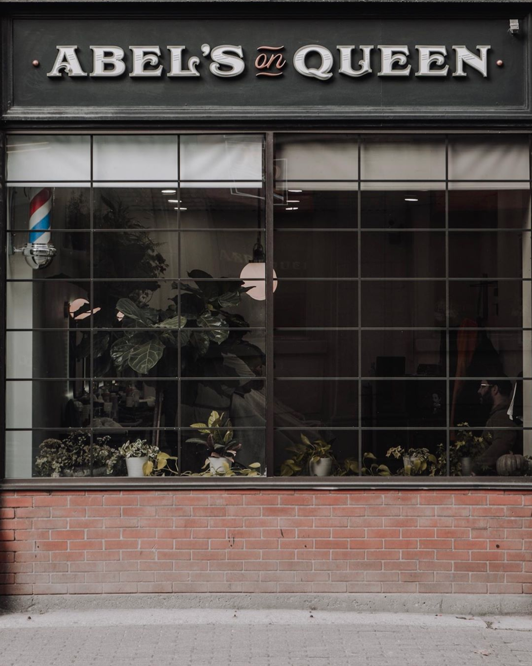
Phase 4: Interior & Exterior Design
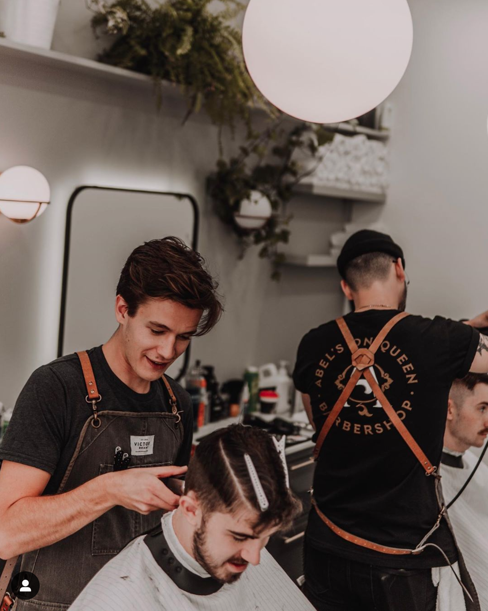
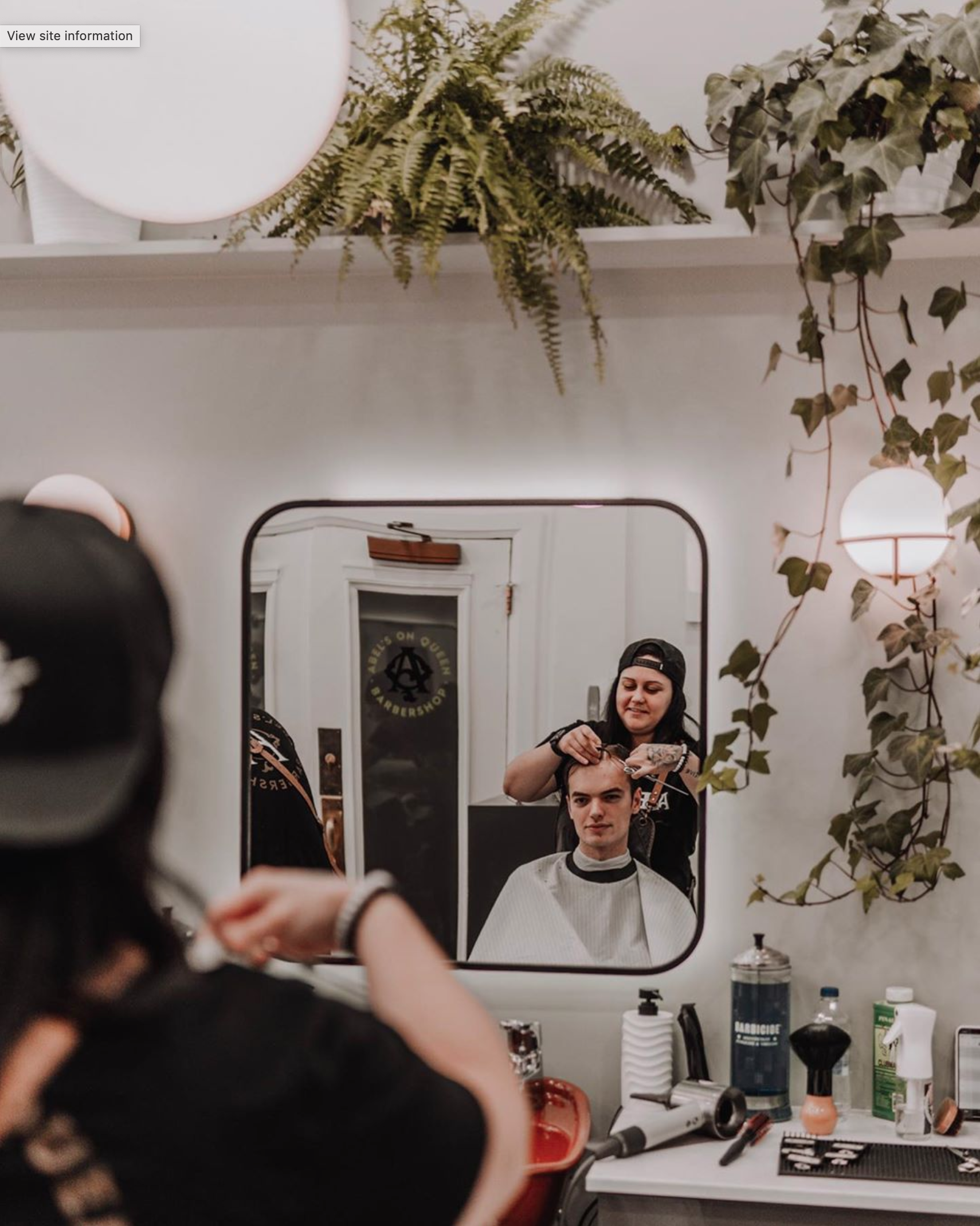
While Abel’s visual identity was inspired by historically informed aesthetics, the interior design of the new barbershop would decidedly reflect a more contemporary aesthetic. The nature of the Walper Hotel’s customer demographic meant that there would inherently be a steady flow of overnight guests, wedding parties, and out of town visitors through the shop’s doors, so it needed to attract people with an appealing environment and experience. This juxtaposition of old and new would act as a visual metaphor for the shop’s brand narrative: Abel Walper’s original barbershop vision, reimagined for present-day Downtown Kitchener.
I’m by no means an interior designer, but I was able to provide some creative direction for the shop’s interior in order to drive the Abel’s brand home in a holistic way. The goal was for the environment to feel timeless—polished and crisp without feeling sterile, lush and lively without feeling tacky.


The existing tiled floor again served to establish the colour palette: plenty of white, some greys and black, with colour pops of green and copper. We explored various tactile materials like concrete, tile, leafy green plants, dark wood and copper fixtures to accentuate the brand colours in an organic setting.
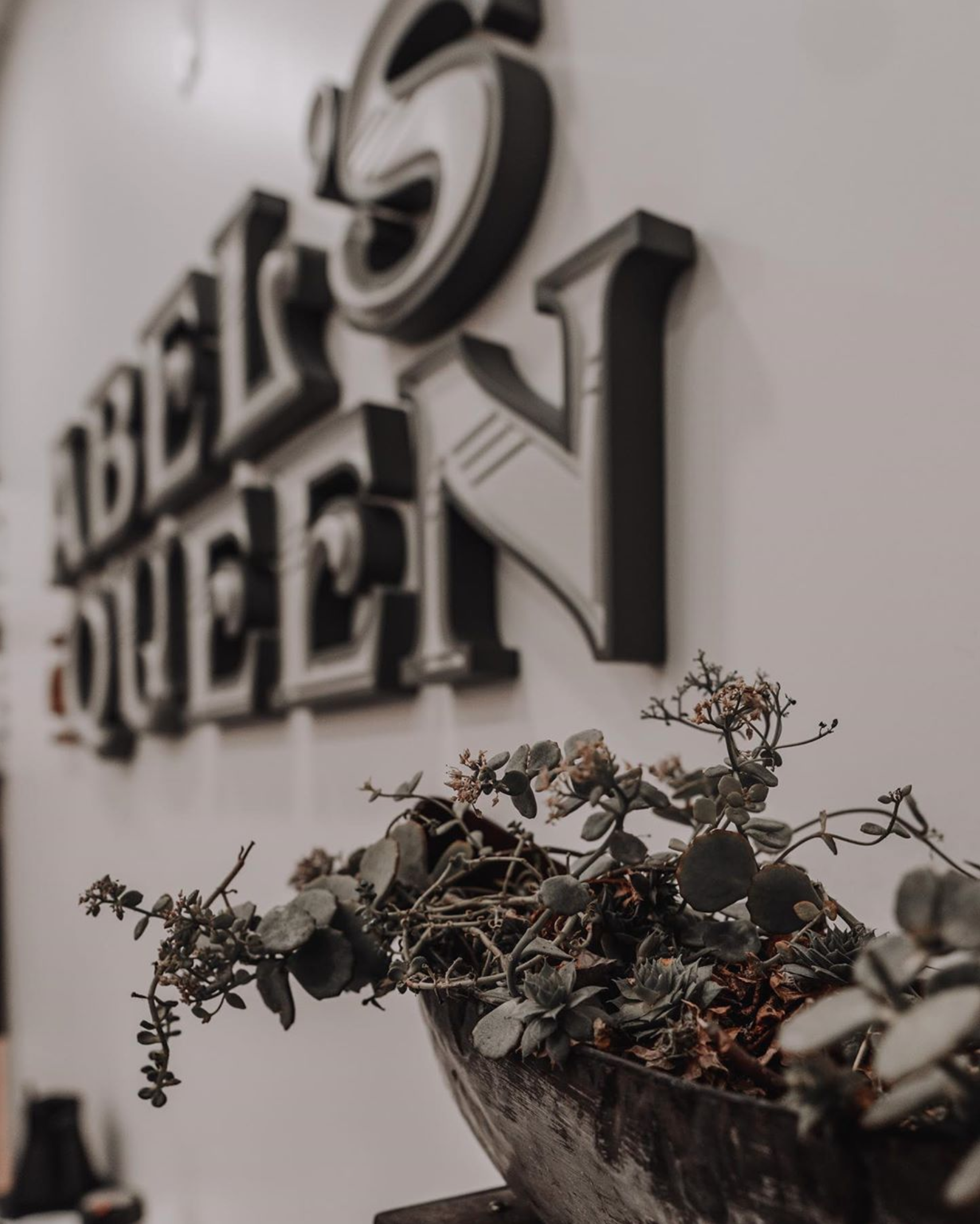
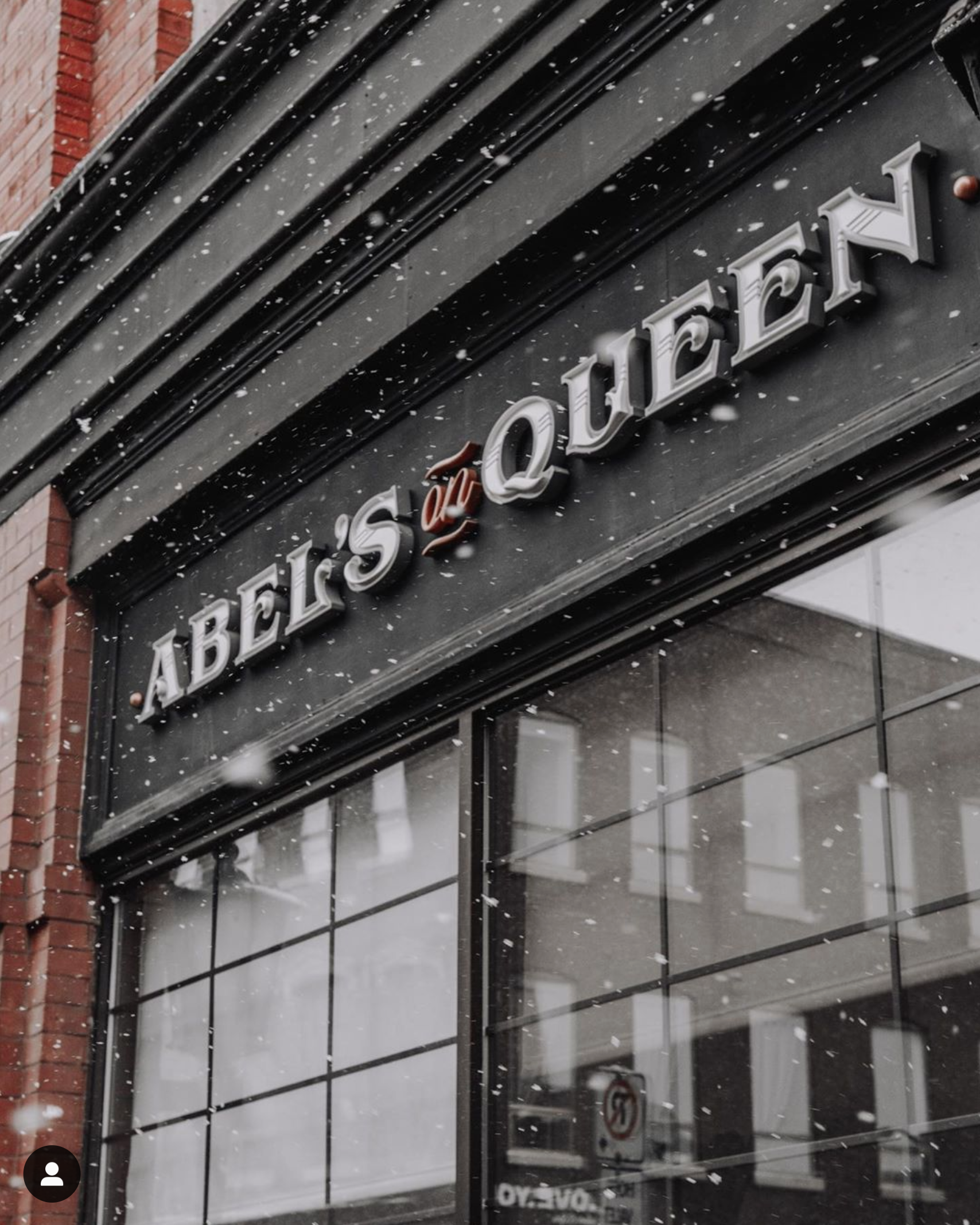
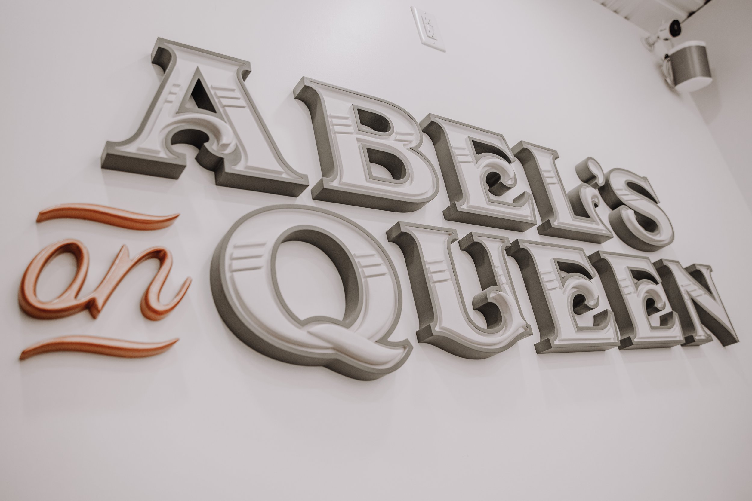
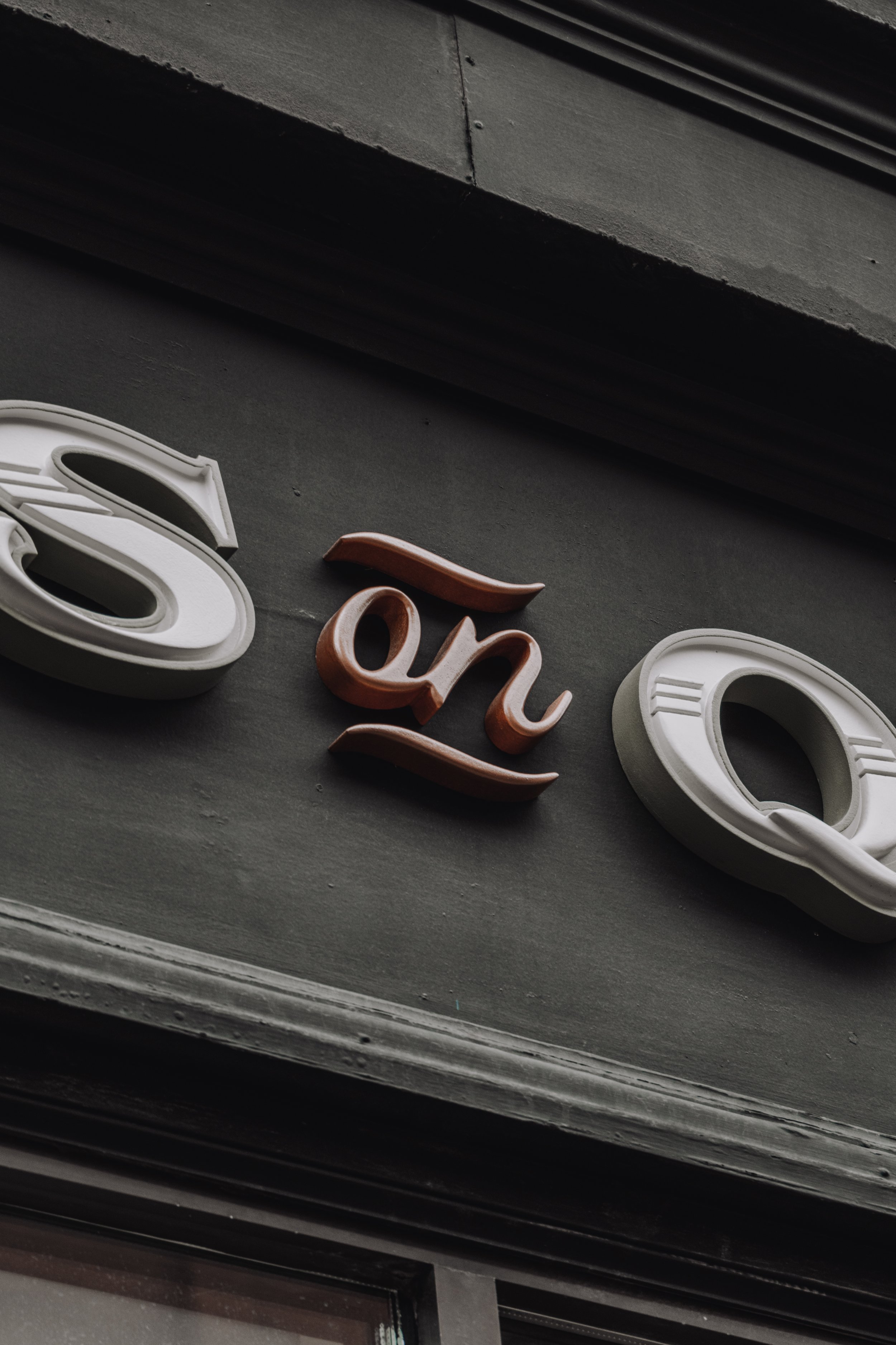
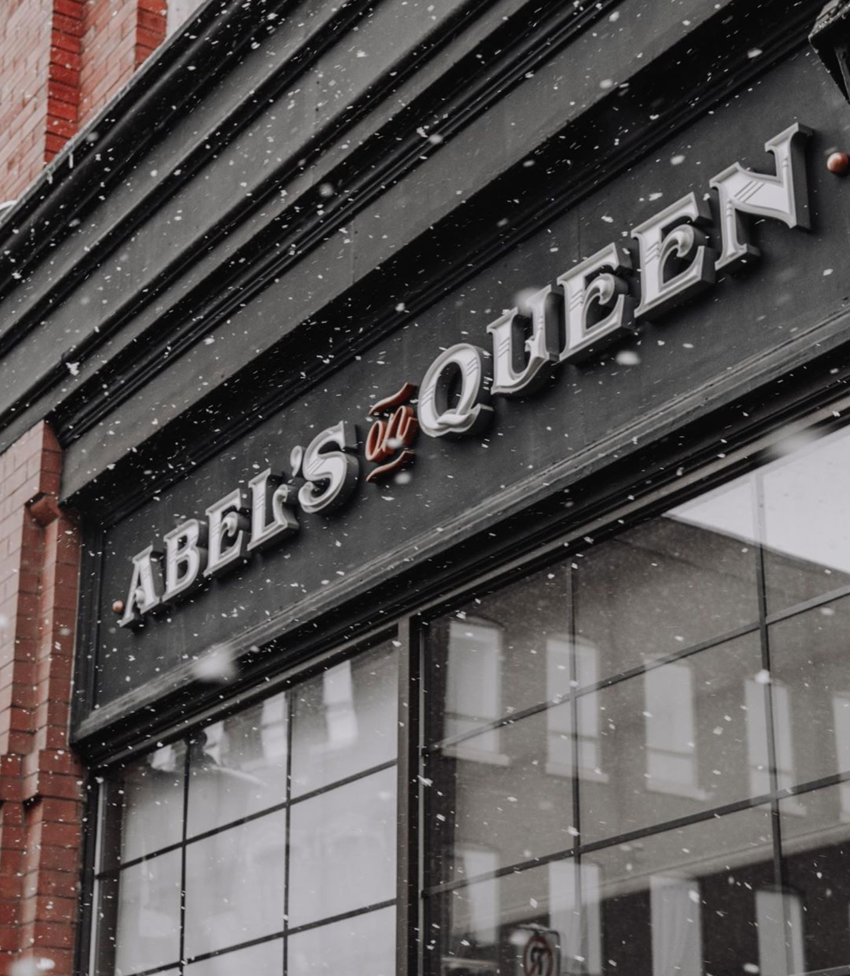
The icing on the cake was the shop signage; the street front facade, hallway entrance hanging sign, and interior back wall all featured the expertly handcrafted work of local legend Adam Straus. Everything came together perfectly, and the shop’s interior and exterior became shining reflections of the intent I put into the brand from the outset.


It’s not every day that a project like this comes along, and I’m super grateful to Mitch for the opportunity and trust in me from the very beginning. Even now as I write this—two years on from the shop’s grand opening—I’m reminded of just how much fun it was to bring Abel’s On Queen to life, and how fulfilling it is to see the shop still thriving today. Nothing would have come together without the phenomenal team involved in every part of the process, along with everyone who keeps the Abel’s name alive to this day; a brand is only as good as the people behind it, and this is hands down one of the best.
— J
Oct. 30, 2021