
DK Agency
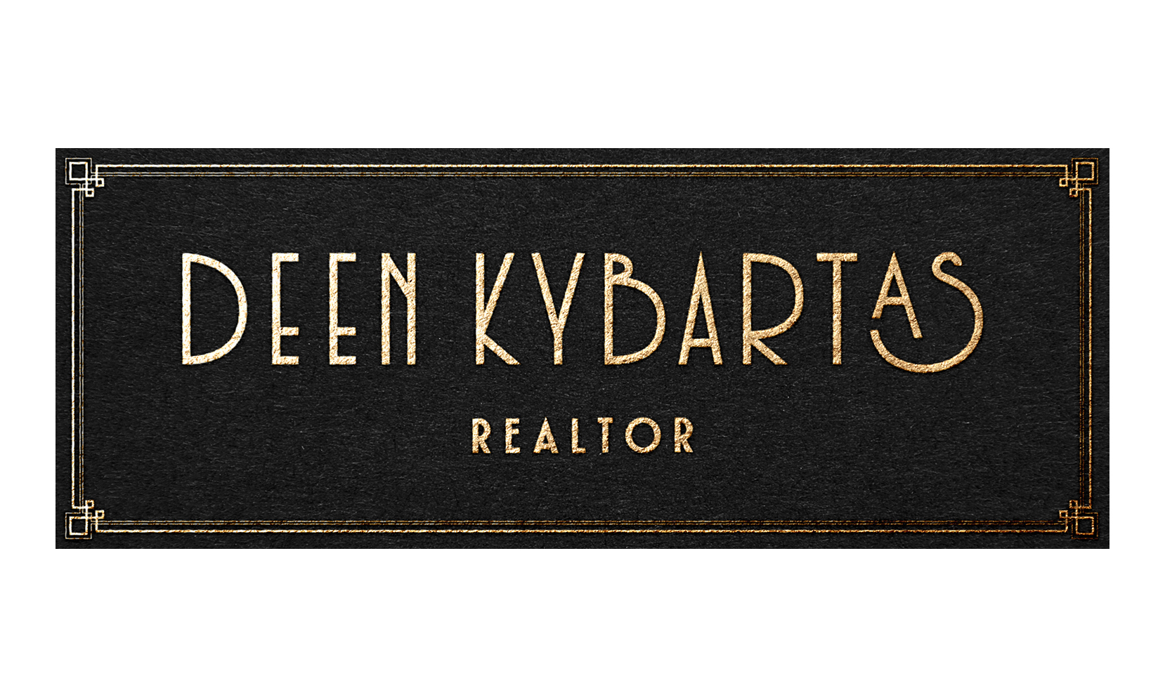
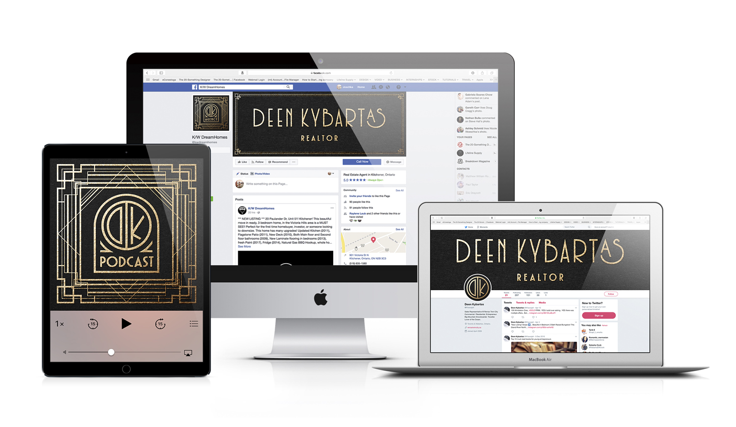
An emphasis on high quality offerings and top-tier customer service lies at the heart of Kitchener-Waterloo real estate brokerage DK Agency’s brand identity. In 2017, agency founder Deen Kybartas set out to create a new company that focused his services into a niche market and placed the needs of the customer at the forefront of his business. The use of letterforms and decoration inspired by 1920s Art Deco in New York City provides a luxurious undertone to the agency’s graphics and messaging, and gold foil-stamped business cards leave a tactile, lasting impression in the hands of customers.

DK Agency
Brand Identity Design • Typography & Lettering Design • Business Card Design
An emphasis on high quality offerings and top-tier customer service lies at the heart of Kitchener-Waterloo real estate brokerage DK Agency’s brand identity. In 2017, agency founder Deen Kybartas set out to create a new company that focused his services into a niche market and placed the needs of the customer at the forefront of his business. In order to communicate the upscale nature of the DK Agency brand, emphasis was placed on the graphic language signature of the Art Deco period of the 1920s, which was synonymous with an affluent upper-middle class demographic. Kybartas' goal was for the branding to speak to a similar audience in Waterloo Region, while simultaneously presenting an air of professionalism and high-calibre service.

Art Deco Inspiration
The use of letterforms and decoration inspired by 1920s Art Deco in New York City provides a luxurious undertone to the agency’s graphics and messaging, and gold foil-stamped business cards leave a tactile, lasting impression in the hands of customers.

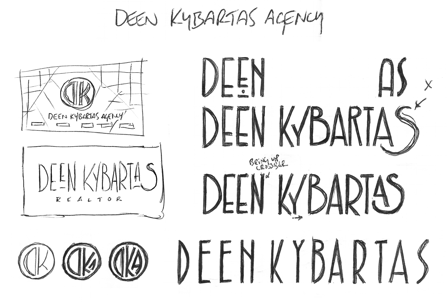
Typeface Design
In addition to the brand identity that I created for DK Agency, I also developed a custom typeface to be used across the company's marketing collateral. From letterheads to lawn signage, the typeface helps to uphold the overall high-end feeling of the brand.