
Captain Earl's Crab Shack
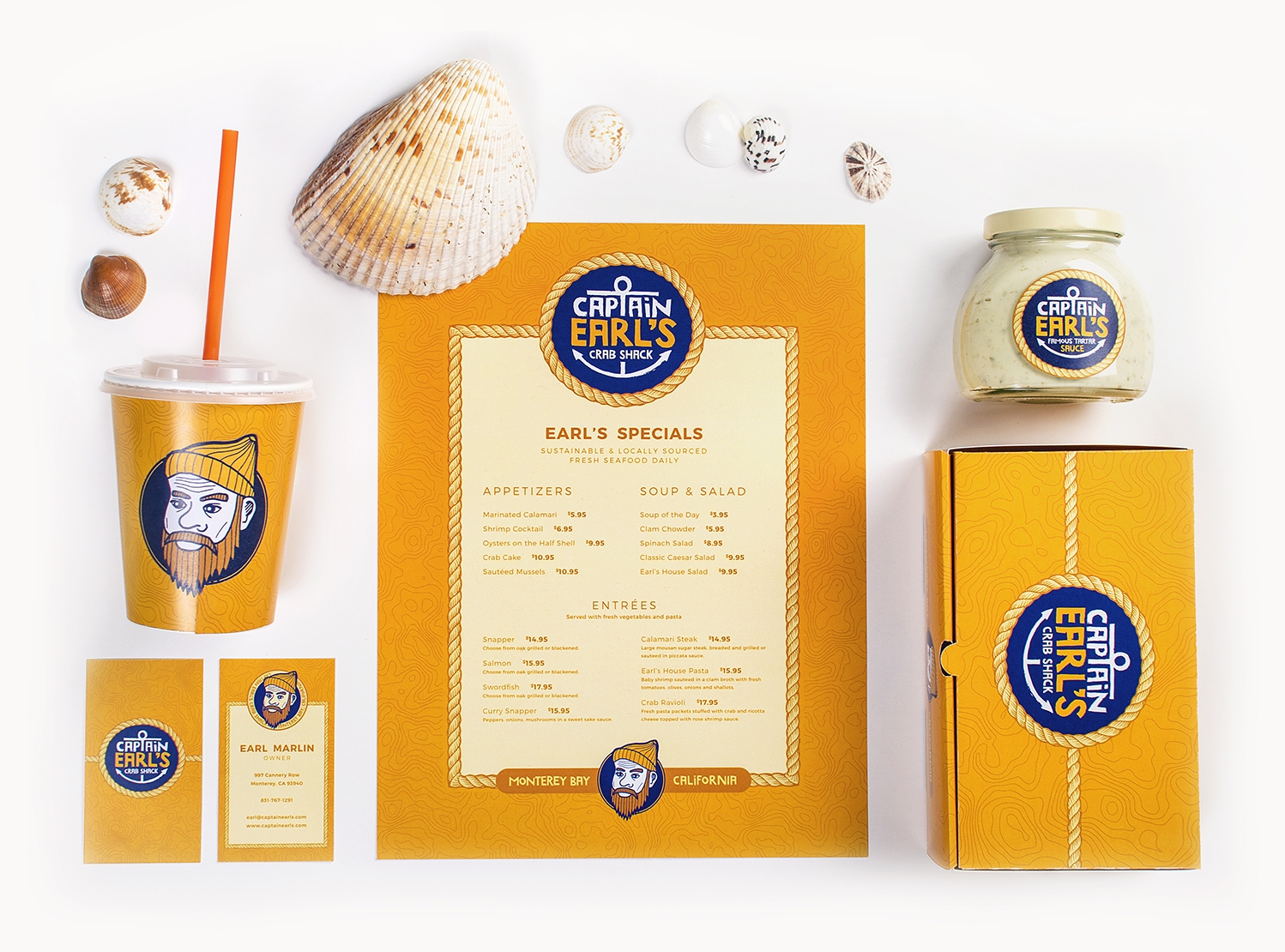
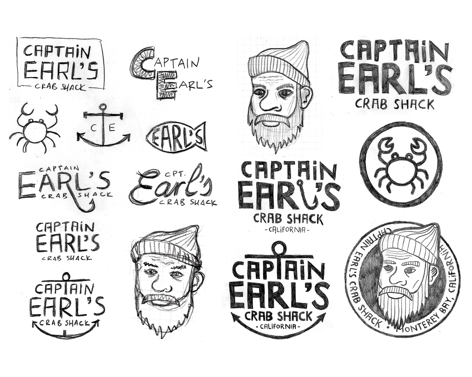
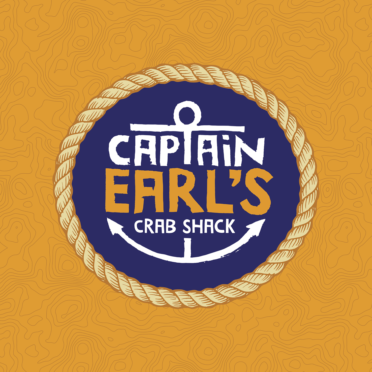
The brand identity and packaging designs for the fictional seafood restaurant Captain Earl’s Crab Shack were conceptualized to bring attention to the crisis of overfishing in North America. Created for a project in my second year of design school, my goal was to present a design solution that meshed the concepts of sustainability and ethically sourced products with a handcrafted design aesthetic. The main logo mark uses hand drawn and linocut techniques to deliver an end result that is applied across multiple platforms of packaging and stationery.
Captain Earl's Crab Shack
Brand Identity Development & Design • Food Packaging DesignS • Menu & Stationery Suite
The brand identity and packaging designs for the fictional seafood restaurant Captain Earl’s Crab Shack were conceptualized to bring attention to the crisis of overfishing in North America. Created for a project in my second year of design school, my goal was to present a design solution that meshed the concepts of sustainability and ethically sourced products with a handcrafted design aesthetic. The brand narrative for Captain Earl's is centred around the image and story of Earl Marlin, an independent fisherman from Monterey Bay, California. Earl's goal in founding an eatery under his own name was to provide the people of Monterey Bay with a healthy lunch or dinner option while enjoying an afternoon at the beach. Featuring fresh-caught daily seafood dishes, Captain Earl's represents a small business that sources all of its own ingredients to combat the issue of overfishing in California.
Recipient of the 2017 Applied Arts Student Award for Entire Design Program

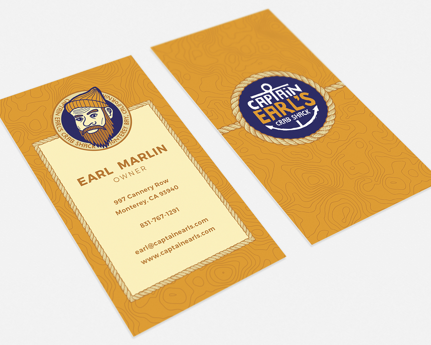
A Handcrafted Approach
The main logo mark for Captain Earl's Crab Shack uses hand drawn and linocut techniques to deliver an end result that is applied across multiple platforms of packaging and stationery. Beginning the project in an analogue setting that was later transported into a digital environment allowed the branding to retain an organic tone flush with personality.

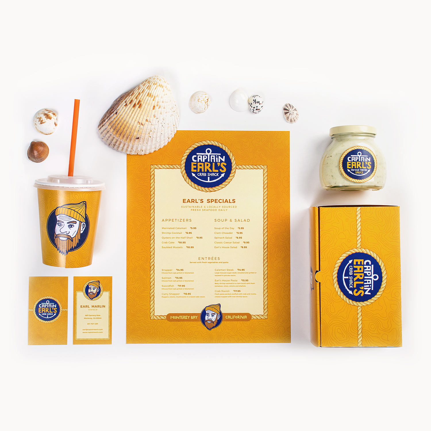
Supporting Collateral
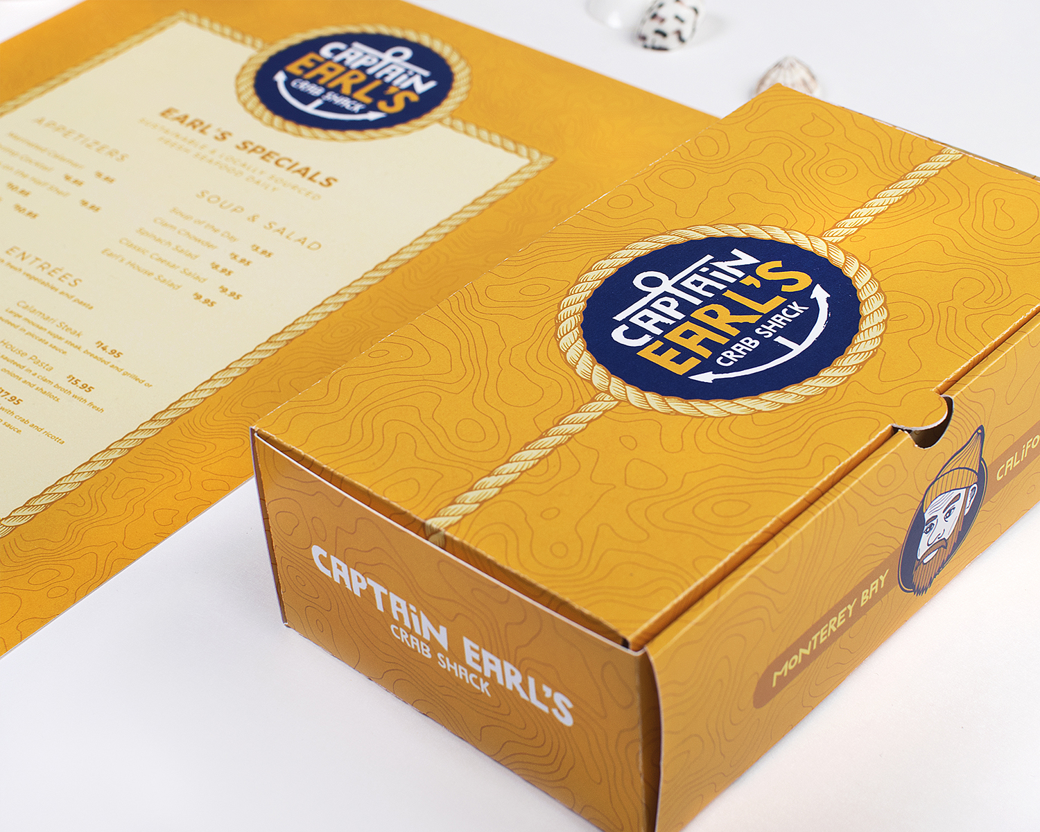
In addition to the primary logo mark and icon, the brand identity for Captain Earl's also incorporates colour and texture to hold its value when used across supporting applications. An illustrated topographic pattern of California's terrain serves as the backdrop for various pieces of brand collateral including restaurant menus, beverage cups and food packaging.